Colours and look & feel are critical for a brand, and we wanted to test ideas with our target market.
We prepared various options to convey different ideas and put them out to test. Here's a sample…
 No clear winner emerged, but findings did support earlier consumer research that found a strong image of a woman with long, healthy hair is a major positive. We learned too that using Marathi with some supporting English would be a good combination – Marathi would set us apart and play well with the consumers while the English would provide a hint of sophistication.
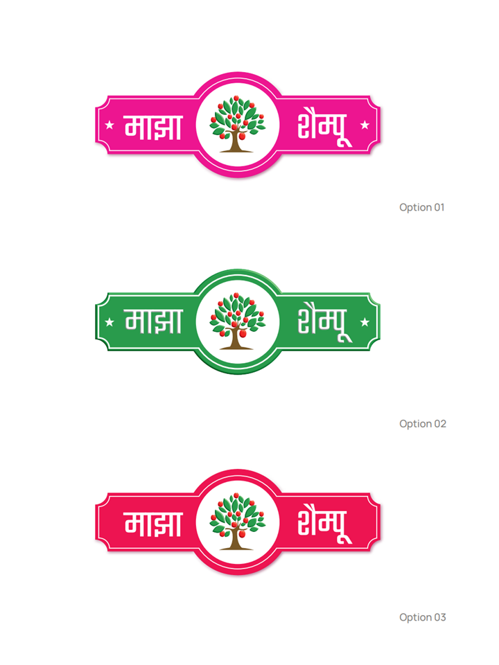
More controversial was the colour. We had our logo, but how should we represent it? We settled on three options…

For a long while red was the front runner and seen as a positive option by some because it would be a distinctive colour for shampoo. But it reminded me too much of RID and other anti-lice treatments, so I was relieved when green drew level and we caste a deciding vote
